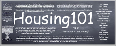
Hey! Look up there! That's a header! Since Housing101 is a school for housing, I decided that it would fit to make the header a chalkboard. Unfortunately, all of the resizing I did has made all the fine print blurry and hard to read. This, and the fact that it doesn't match well with the rest of the blog may lead to it being deleted soon. Comment on if you like it or not! If enough people say they like it, I might keep it.
-Malorn
Actually, it's really ugly to look at. I'm taking it off for now, but here's a picture of it anyways.
-Malorn
Actually, it's really ugly to look at. I'm taking it off for now, but here's a picture of it anyways.
If you like it, then comment.

I enjoy the look of it, but is the smaller print meant to be read? I can't make out the words.
ReplyDeleteDes
@Destiny It's meant to be that way, I think.. xD For effect, y'know?
ReplyDeleteI give it approval. :D
Yeah, it is meant to be that way. I like the header myself, but it just doesn't look good when I set it as the header.
ReplyDeleteIt looks good as picture size, but when you make it bigger, it gets blurry, and it doesn't fit right at the top. It's also hard to make it match with the rest of the blog's color.
ReplyDelete